Following a spike in automobile thefts through the early 1970s — many of which involved tampering with stolen tag numbers to elude police detection — the German government commissioned a new license plate typeface. It was December 1977, and Germany was still raw from a recent rash of hyackings, murders and suicides associated with the Red Army Faction. [...]
Born awkwardly between eras — drawn by hand in order to be better read by machines — the falschungserschwerende Schrift font bears the marks of both 19th-century quild-enshrined handcraft and 20th-century anonymous automation. And like any technology, if ts bound by the political determinants of its design : while ifs original “ tamper-proof ” premise may have proved a MacGuffin, these weird-looking letters are an early product of our contemporary surveillance state. What reads to us as a clumsy lack of formal continuity ts exactly what makes it legible fo a computer. It is an alphabet whose defining characteristic is precisely that it has no defining characteristic, other than
having no defining characteristic.
– “ Falschungserschwerende Schrift, ” Benjamin Tiven, Bulletins of The Serving Library #3, 2012
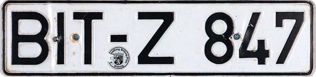
Germancar licenseplate, Fälschungserschwerende schrift, c. 1980, 11.3 x 46 cm