Donald Knuth began his Josiah Gibbs lecture “ Mathematical typography ” with an apology of sorts, saying: “ I will be speaking today about work in progress, instead of completed research, this was not my original intention when I chose the subject of this lecture, but the fact is I couldn't get my computer programs working in time. ” And he continues, “ Fortunately it is just os well that I don’t have a finished product to describe to you today, because research in mathematics is generally much more interesting while you're doing it than after it’s all done. ”
Meta - The - Difference - Between - The - Two - Font has a similarly incomplete character. As a set of simple letterforms and a collection of meta-design parameters, MTDBT2F will create unending numbers of different fonts from now onwards, always only moving forward and compiling a collection of surface effects onto its essential skeleton to produce a growing family of
“ hollow ” fonts whose forms have more in common with handwriting than they do with hot metal counterpunches (not to mention modern digital fonts). The clumsy result, with its chewy name Meta - The - Difference - Between - The - Two - Font, arrives before the effect that is applied to it, returning to a moment before fonts, just before Gutenberg’s first black-letter Gothic types attempted to match the scribe's penmanship. At this point, to computer-automate the production of handwritten calligraphy, and to more or less ignore 400 years of typographic tradition,
is essentially absurd.
It seemed like a good idea at the time.
– " A Note on the Type, ” Dexter Sinister, Bulletins of The Serving Library #1, 2011
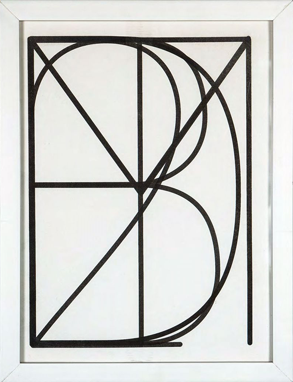
Dexter Sinister, Meta - The - Difference - Between - The - Two - Font compostie glyph, 2011, Risograph print, 33 x 25.3 cm